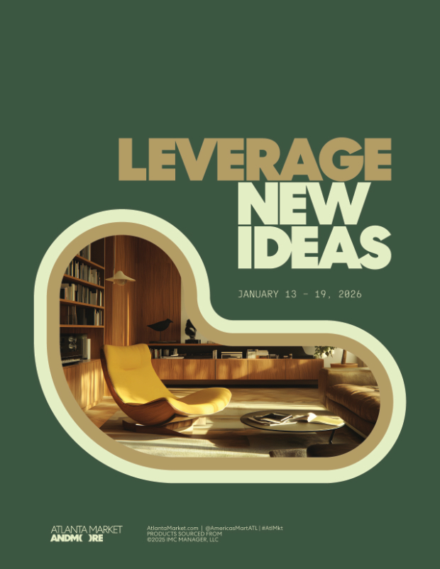
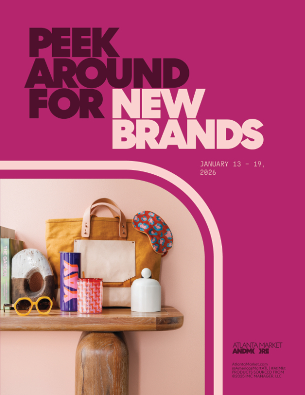
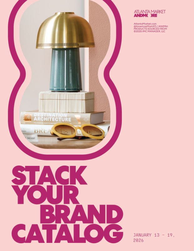
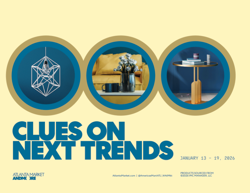
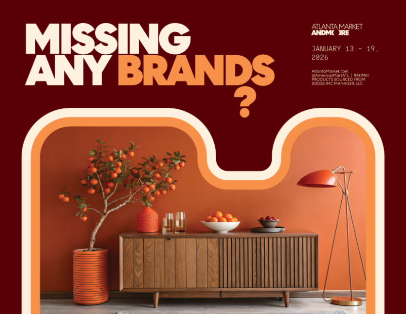
I masked imagery using shapes to draw a connection to each ad's tagline. For additional visual coherency, I applied double strokes with weights that match the header's weight.
Using this visual concept, I wanted to show a variety of layouts. I used our typical combination of photoshoot image, header, market dates, market logo, and additional info. As this was early on in campaign development, color palettes were also not determined yet.